trust

The Taunton web design company you can rely on
At it’seeze Web Design Taunton, we offer worry-free website design services throughout Somerset, helping businesses like yours to get online without the hassle.
We make getting a website designed for your business as easy as possible by handling everything for you. From the web design and technical maintenance through to website security, hosting, domains, and your email setup – we’ll do it all.
This leaves you free to spend time on what matters – running your business. We’ll also provide you with ongoing support for the lifetime of your website, so there’s always expert advice available when you need it.
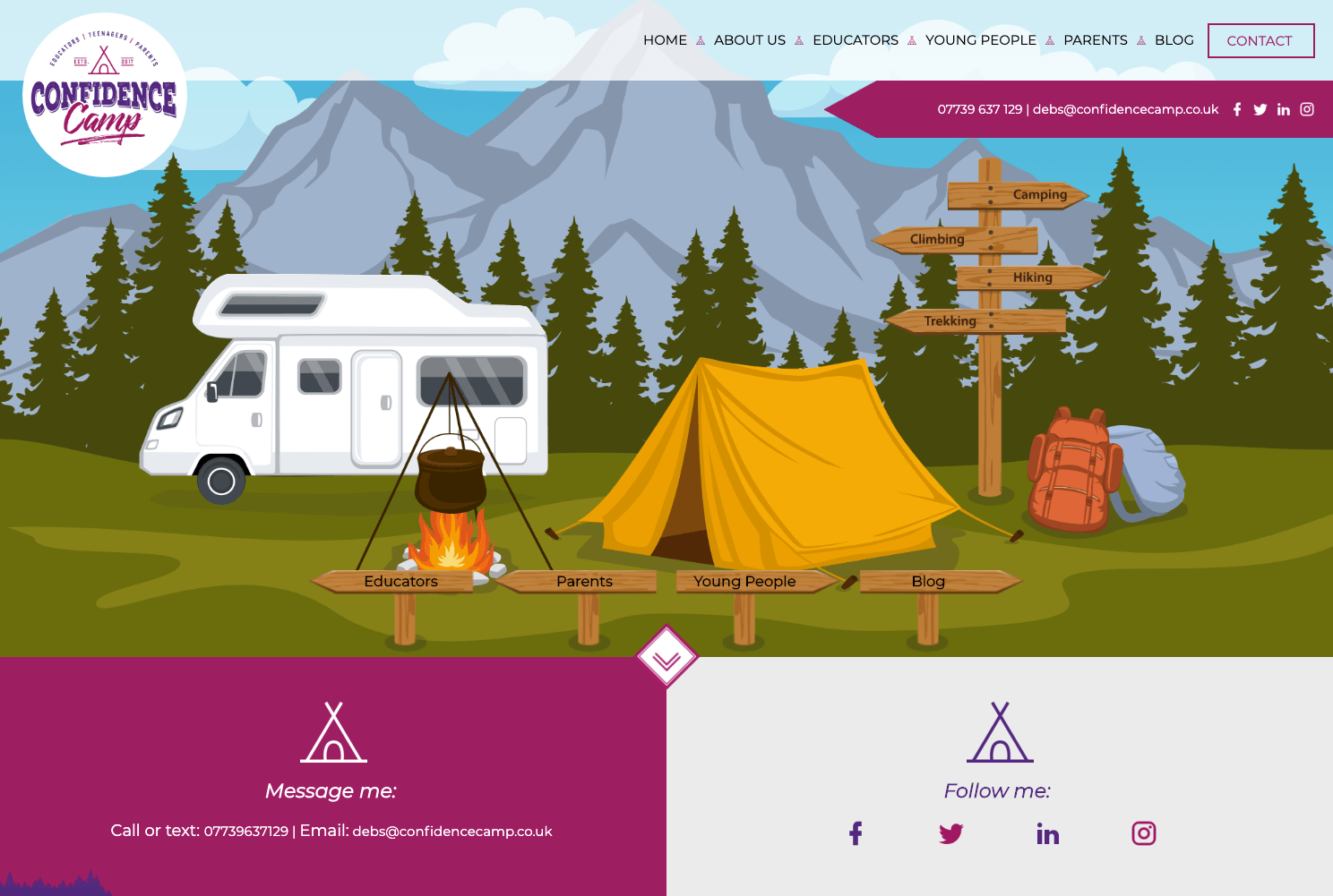
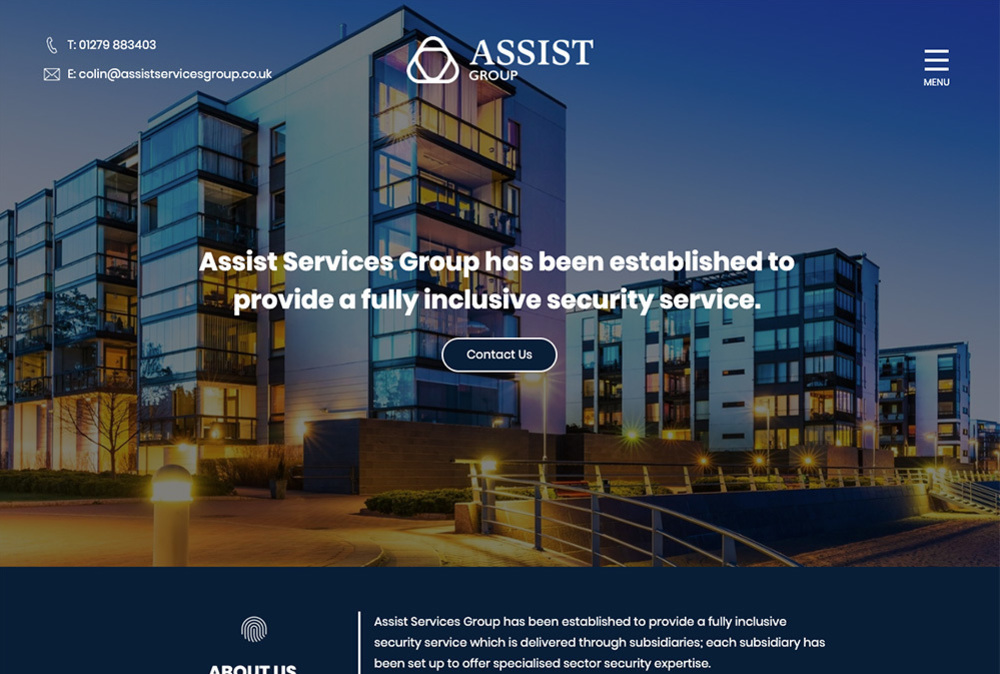
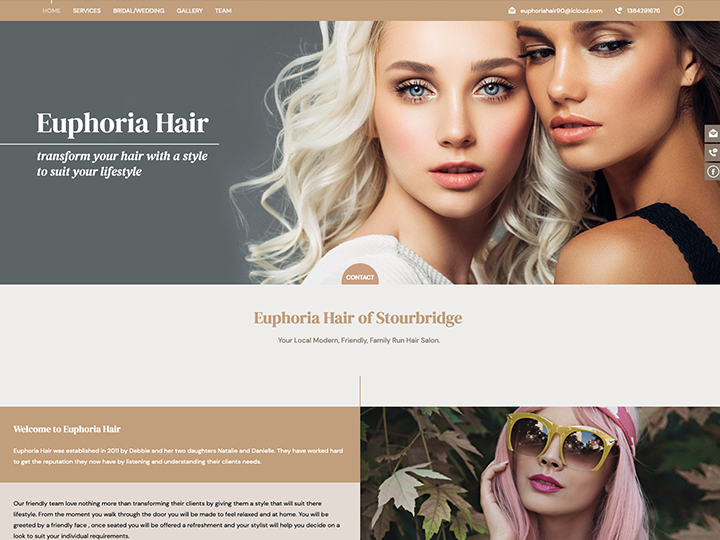
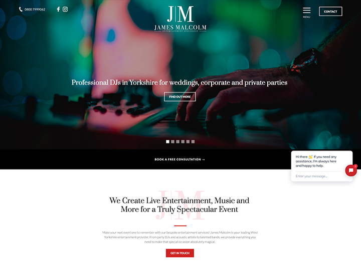
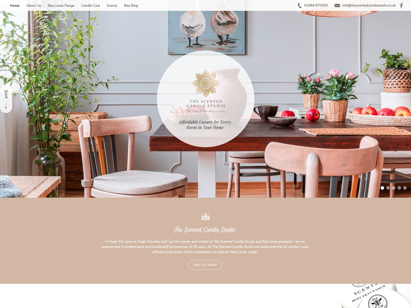
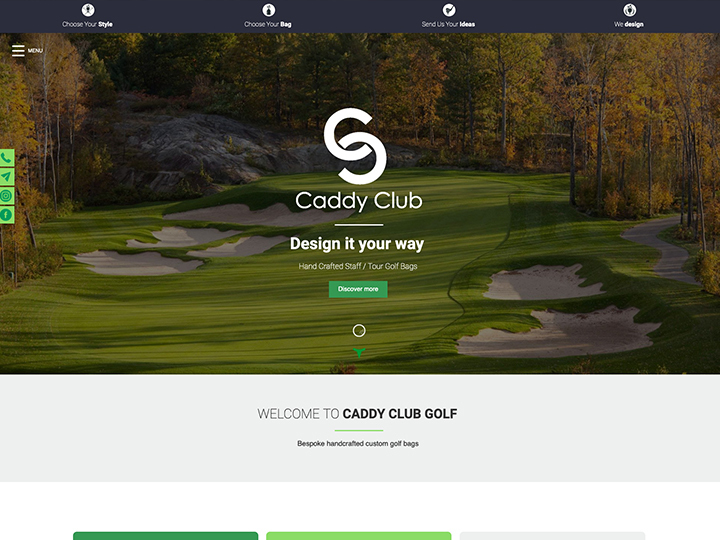
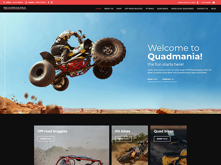
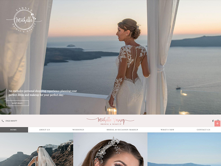
Latest projects
create
How we help Taunton businesses

Web design that works hard for you
We’ll work closely with you to ensure you get a website that’s a perfect fit for your business. Professionally designed and one of a kind, it will help you stand out from the crowd online.

Easy editing with all the latest tools
Our nifty website editor makes it quick and easy for you to make changes, and you’ll also benefit from regular updates with all the latest new tools and features at no extra cost.

Secure, GDPR-compliant websites by design
Enjoy complete peace of mind with a website that takes security seriously. You’ll benefit from a free SSL certificate, regular updates, daily backups, security checks, and plenty more.

Affordably priced with no hidden fees
Our websites provide all the essentials for online success, with transparent pricing to boot. With a choice of affordable packages, we offer something for every business and budget.
grow
All the support you could need

Friendly, reliable team
If ever you have a website query, or just need a helping hand, our team are here to support you from the get go and make sure you get the most out of your website.

Jargon-free advice
There’s no need to learn the lingo when you work with us. We keep it simple, only offering website assistance in plain English so that everyone can understand.

Online support centre
Our dedicated online support centre is there when you need it, full of marketing tips, editing guides, how-to videos, website FAQs and more, and accessible 24/7.
Trusted by businesses throughout Somerset
Find out why we’re the web design company of choice for businesses in Taunton and beyond

Ready to grow your business online?
We’d love to help you take your business further with a brilliant new website – get in touch with us to find out more.